You’ve done the hard part – you’ve developed a product, bought the domain name, found the manufacturer, and your inventory is set to go.
Unfortunately, without a functional and, yes, pretty Shopify store, you may not see the success you deserve.
A Shopify store is not only the way you present your product to your target audience but also the place where you can generate sales.
A great Shopify store is many things:
- It looks nice. This means that the information is easy to understand, and your products are showcased with professional photos. This is where a great theme comes into play (more on that later).
- It navigates well. This means that it’s easy for your website visitors to immediately know where they can find the answers to their questions, where they can contact you if needed, and where and how they can make a purchase.
- It is set up for SEO. We all know you write for users and not robots, but SEO still matters for a Shopify site. We won’t detail SEO tips in this article, but visit here for more information about how to optimize your store for search.
If you’re just getting started, the easiest way to understand what makes a good Shopify store is to see examples of those doing it best.
This can help inspire how to set up your store and your ecommerce strategy as a whole.
How many touchpoints until you hope to see a purchase?
Which pages will you run remarketing ads on?
What photos are most successful and should be shared on social media?
These are all aspects of your ecommerce strategy that can start with a great Shopify store.
Below are some of our favorites and why we love them so much.
While some of the bigger sites might use a custom Shopify theme (where you can still draw inspiration!), if we could find the Shopify theme used, we added that for you below:
1. Greyston Bakery
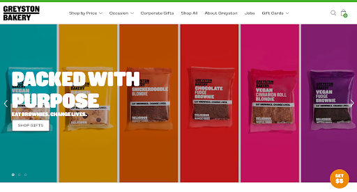 Screenshot from Greyston Bakery, July 2022
Located in Southwest Yonkers, New York, this B-Corporation is best known for baking the brownies you enjoy in a Ben & Jerry’s Chocolate Fudge Brownie ice cream.
The company prides itself on offering personal development tools and professional training to give anyone who works there the best chance of success.
It accepts all applicants regardless of previous incarceration, homelessness, or drug use.
A truly inspiring place with an amazing product, this is #1 on our list for a reason.
We love the use of colors and bold CTA immediately when you arrive on the website.
The “shop by price” is also a great feature that you don’t see on every ecommerce store, but a quick and easy way to get people to what they want without having them sift through something out of their price range (which can often lead to a bounce).
2. Happy Organics
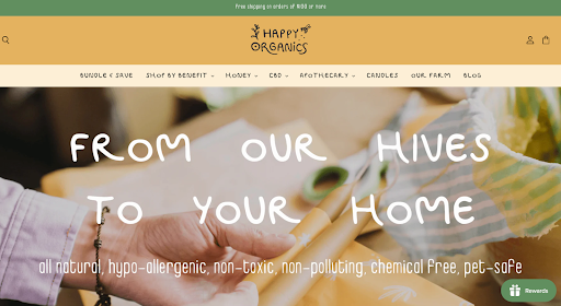 Screenshot from Happy Organics, July 2022
Happy Organics is a three-generation business of beekeepers.
First started in Mexico, the company began when the father of the family was diagnosed with cancer, and could no longer tend to the bees.
So, his children found a way to use this same honey, and infuse it with CBD to improve his pain.
As it turned out, there was a long list of therapeutic benefits to CBD and honey, which you can read about more on their site.
As you can see on their site, the words “Bundle & Save” are first in the menu.
This typically draws a visitor’s eye and drives traffic to the page.
The company likely wants people to visit this particular page because it saves the customer money by bundling and allows Happy Organics to upsell.
It’s a win-win.
- Shopify Theme: Superstore.
3. Bombas
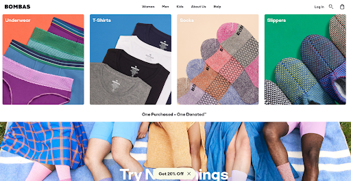 Screenshot from Bombas, July 2022
Another classic, Bombas got its start on Shark Tank.
Despite Shark Daymond John saying he immediately tuned them out and was thinking about the next pitch, the quality of their socks won him over.
Bombas has since expanded beyond just socks and is currently the most successful company to come out of the show.
The best part?
A portion of its proceeds are donated and always have been.
In terms of its Shopify store, Bombas is dialed.
It keeps it simple with different categories and doesn’t clutter up the menu with different options.
If you visit Bombas’ site, you’ll see lots of well-placed CTAs that allow the visitor to clearly understand their options while nudging them to buy (note the “get 20% off” link at the bottom!).
4. Patagonia
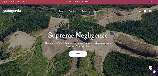 Screenshot from Patagonia, July 2022
This is a company you’ll see on many “best Shopify sites” because its shop is complicated (it has quite a few products!), but organized beautifully with sections and subsections.
Not only does Patagonia guarantee everything it makes, but the team focuses on environmental and social responsibility, and pledges 1% of sales to the preservation and restoration of the natural environment.
As one of the largest outdoor brands, Patagonia does a fabulous job illustrating what makes the company unique and makes it easy to find what you need in just a few clicks.
5. Cheekbone Beauty
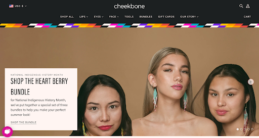 Screenshot from Cheekbone Beauty, July 2022
Cheekbone Beauty has a great story, and it makes sure to highlight that right on the homepage of its Shopify store.
All of the company’s products are vegan and cruelty-free, and it has a commitment to become waste-free by 2023.
The kicker?
Not only is Cheekbone’s product sustainable and good for the environment (it uses 85% less plastic than traditional lipstick tubes), but the team donates 10% of their profits each year.
- Shopify Theme: Blockshop.
6. Pipcorn
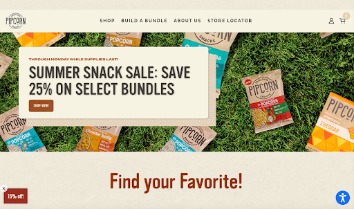 Screenshot from Pipcorn, July 2022
Pipcorn/Pipsnacks is another Shark Tank find.
After appearing on the show, the brand’s sales increased from $200k to $1.1 million and saw 12,000 orders come through – roughly 11,000 more than it had ever had.
It’s safe to say Pipcorn kept the momentum going, and it is now one of the top popcorn brands on the market.
The company reimagined popcorn by using heirloom corn because it is more environmentally sustainable (and also more nutritious).
One thing we love about this store is the emphasis it puts on the family-owned aspect of the product – and if you visit Pipcorn’s blog, you’ll see that it also supports other small family-owned businesses.
The shop also puts discounts in just the right places and has recommended items to add after viewing your cart, making it very easy to buy!
- Shopify Theme: Starter theme.
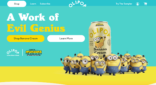 Screenshot from Olipop, July 2022
Visit the Olipop website and you’ll see rotation offers at the top of your screen – the only one on this list to do so – and a very simple design.
Olipop tastes like your traditional soda, but supports microbiome and digestive health support with plant fiber, prebiotics, and botanicals.
According to Shopify, when considering your Shopify store,
“Consider how you want customers to feel when they shop with you. Do you want them to feel relaxed and summery? Or what about warm and cozy? The colors you use will influence how shoppers feel, so use your palette wisely.”
Olipop is the perfect example of a brand putting an emphasis on color.
8. Tasty Tie
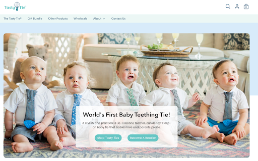 Screenshot from Tasty Tie, July 2022
These baby ties with teether’s on the end are oh-so-cute, but they also have a great Shopify store to boot.
As you scroll down the page, you’ll notice that this store is all about the features and benefits.
While it’s immediately clear what the product is, there are many less obvious benefits that are also listed right there on the homepage.
For example, the tie has a crinkle material (something you clearly cannot see in a photo), and the page’s content paints a picture of why that matters.
In short, this is a good place to start if you’re looking for content inspiration for your Shopify store.
9. Allbirds
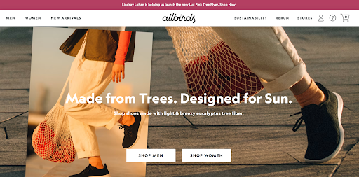 Screenshot from Allbirds, July 2022
This example and the next one on our list are widely considered great Shopify store examples, and for good reason.
Allbirds’ store features great photos, bright colors, easy navigation, and also outlines the company’s sustainability approach with clear initiatives:
- Reverse climate change.
- Improve carbon footprint.
- Regenerative agriculture.
- Use renewable materials.
- Offer carbon offsets.
- Focus on responsible energy.
Allbirds has created a page for each of these initiatives with all the necessary details. Truly inspiring.
10. Ruggable
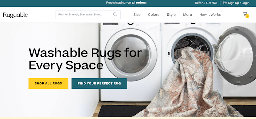 Screenshot from Ruggable, July 2022
Ruggable is the only store on this list that really puts video to use in showcasing its product.
If you’re looking for video inspiration, this is the one to check out.
It also has a “find your perfect rug” button front and center, where users can take a quiz to filter their rugs based on what works for them.
This is a fun and interactive way to make customers feel that their experience is more personalized.
The more you learn about Ruggable, the more you realize that this has definitely guided the brand’s ecommerce strategy as a whole.
More resources:
Featured Image: Kaspars Grinvalds/Shutterstock
if( sopp != 'yes' && addtl_consent != '1~' ){
!function(f,b,e,v,n,t,s) {if(f.fbq)return;n=f.fbq=function(){n.callMethod? n.callMethod.apply(n,arguments):n.queue.push(arguments)}; if(!f._fbq)f._fbq=n;n.push=n;n.loaded=!0;n.version='2.0'; n.queue=[];t=b.createElement(e);t.async=!0; t.src=v;s=b.getElementsByTagName(e)[0]; s.parentNode.insertBefore(t,s)}(window,document,'script', 'https://connect.facebook.net/en_US/fbevents.js');
if( typeof sopp !== "undefined" && sopp === 'yes' ){ fbq('dataProcessingOptions', ['LDU'], 1, 1000); }else{ fbq('dataProcessingOptions', []); }
fbq('init', '1321385257908563');
fbq('track', 'PageView');
fbq('trackSingle', '1321385257908563', 'ViewContent', { content_name: '10-shopify-store-examples-to-inspire-your-ecommerce-strategy', content_category: 'ecommerce seo' }); }

