Welcome to Feature Friday, a series where we get candid about emails that caught our attention recently, fresh from our own inboxes here at Litmus.
This Friday, we’re highlighting two emails, one from our Favorite Email series and another from my own inbox. I picked Logan Sandrock Baird’s (Litmus’ Senior Community Evangelist) brain on first impressions, and we talk about things that worked and things that could use some love.
Watch the video recap below, or read on for the full breakdown.
View this post on Instagram
ModernCTO
Baird: Taking a look at this email from ModernCTO. Looks like we’re going for a plain-text email approach.
People realize that they would like something that felt as though it was being emailed from another human being. And this is a way, one of the strategies, that people are employing to recapture that.
Huang: I think what worked was the attention grabbing subject line (“Re: Podcast & Shrek,” in this case), but at the same time it felt deceiving. And icky.
Read more: RE: Misleading Subject Lines →
Baird: I love that this is about Shrek and I definitely understand why you chose this email, Kim.
Huang: What it does well here is leaning on pop culture references to grab people’s attention. And I definitely think that’s something that marketers, when appropriate, should use in their emails.
Baird: Definitely in terms of the written content, they have done very well.
Huang: Conclusion: this cold email got my attention. Is it my favorite? No, but also cold emails in general aren’t anyone’s favorites, either.
Baird: Cold emails leave me fairly cold, overall. I understand it as a tactic. I question it a bit as tactic.
Maileg
Huang: Email number two, from Maileg. What are your initial thoughts? What do you see?

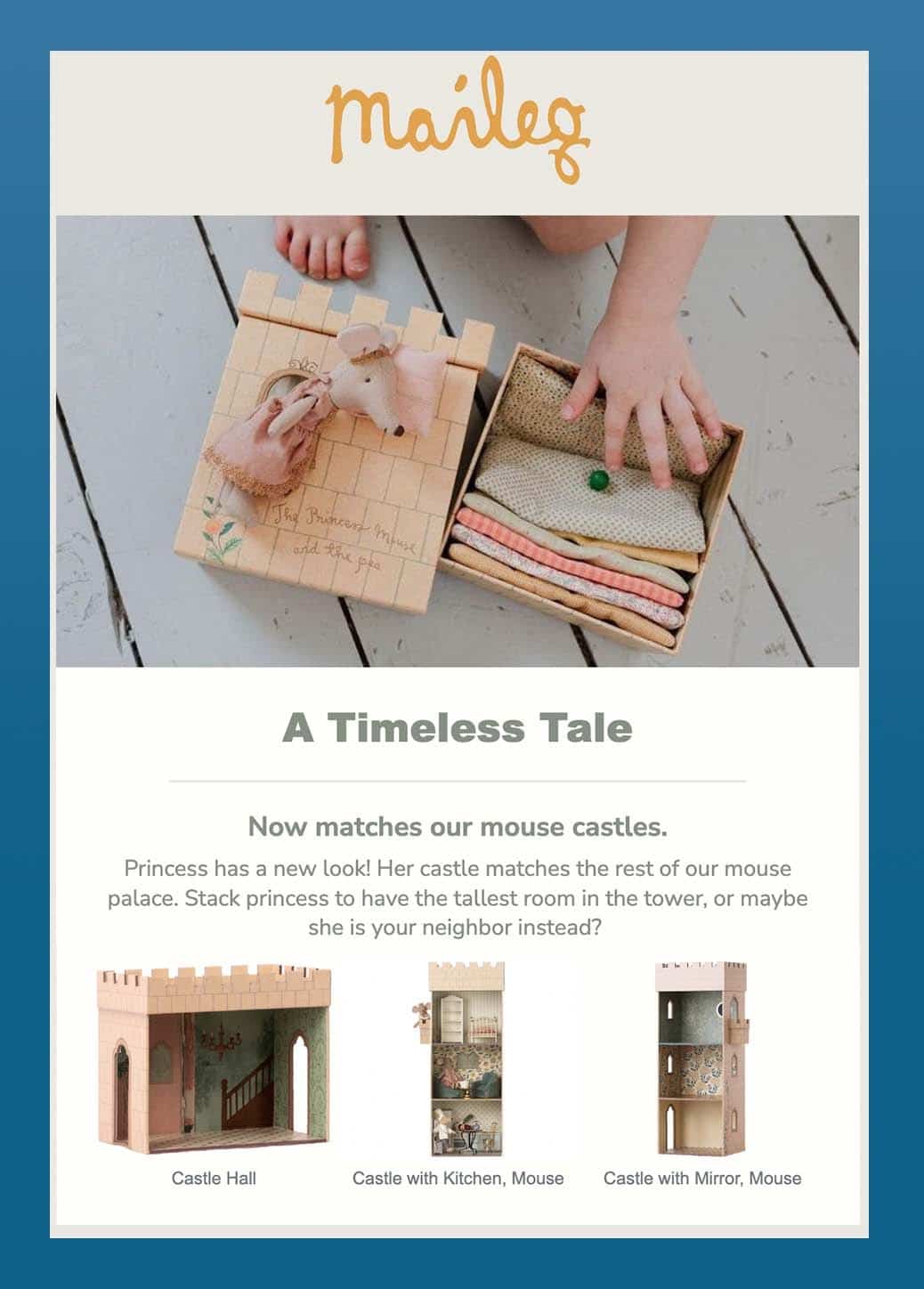
Baird: Initially, what strikes me is the the use of imagery at the top. They’ve got here a lovely hero image that contains what looks like a child’s hand and foot, and it’s clear that they’re about to play with it or dig into it, in some sort of sense.
To some degree, imagery with people in it can be more effective, because we look for ourselves out in the imagery we see in the world.
*scrolls*
Okay, this is adorable. This has a new look.
The animated GIF gives brings this product to life in a lot of ways. I really like it. And it doesn’t look like it’s too many frames, either.
Read more: Animated GIFs in Email: 10 Tips for Keeping File Sizes Small →
This might be a better choice for the hero image. Or it might be worth A/B testing to see if you have any change in email engagement.
And we’ve got live text too in the headline, which is good.
Quick note: the text underneath the headline is center aligned, at three to four lines. I think you can get away with two to three lines centered—but it’s always worth noting that for accessibility purposes, left aligning text creates a consistent visual anchor point for each start of a new line. And that just makes it a lot easier for anybody with dyslexia.
*scrolls*
Let’s see…

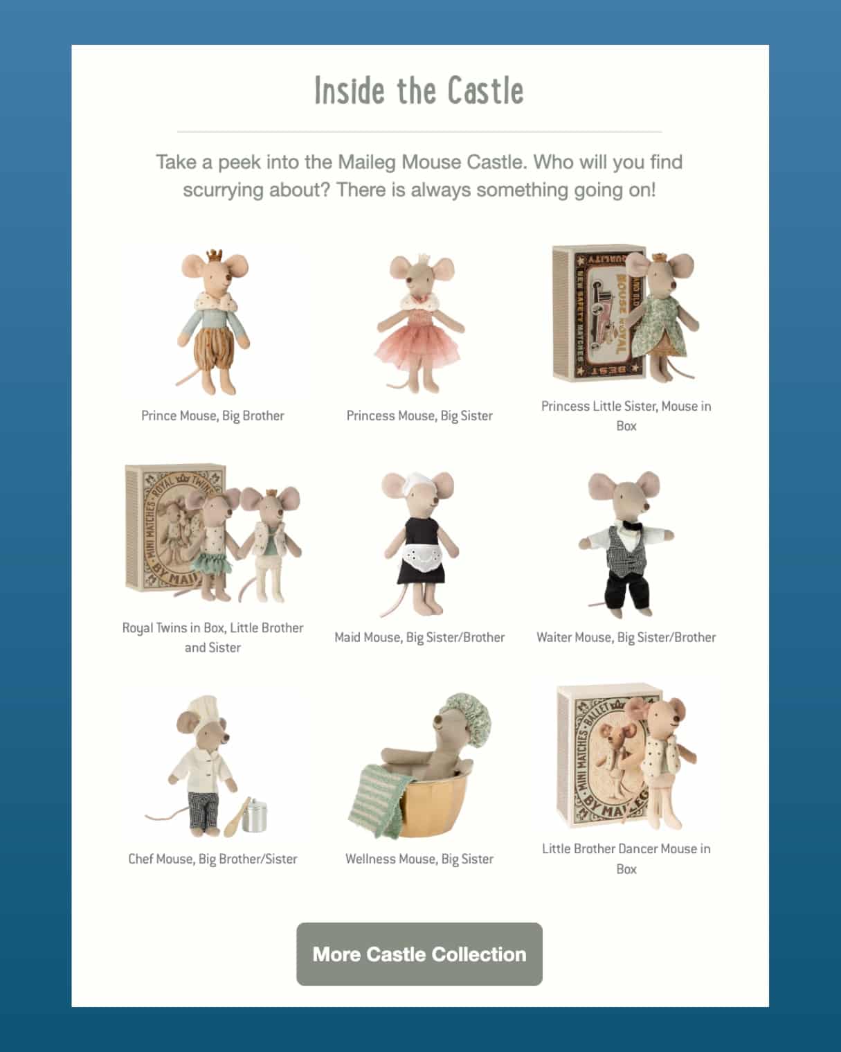
Now we have a three-by-three grid of images—a great way of displaying all their products at once. I wonder if it would be worth the time to make an arrangement of images that allowed the images themselves and the caption text be a bit larger.
Again. These are adorable. Very clearly adorable. But they are pretty small. I mean… they’re already mice, so they’re already… you know… pretty small in that regard as well.
Tune in next month 
There you have it! We’ll be back for our next installment of Feature Friday next month.
Got an email you want us to highlight? Give us a shout on Twitter!
The post Feature Friday: Animated GIFs and Cold Emails appeared first on Litmus.


